More than we might think. Colors, defaults, layouts, features. Some "features" the vendor may try to sell you can be kludged in from other sources.
Some local examples:
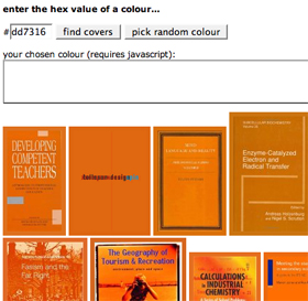
What can be ugly: color schemes, layout, URLs, results, clickpaths
Jessamyn West is a community technology librarian and the editor of the weblog librarian.net. She teaches email classes for seniors, builds tiny websites for tiny libraries and advocates for sensible technology use for everyone.
IM her at iamthebestartist.
This presentation was created in HTML using CSS. There was no PowerPoint involved in this presentation except as a nagging bad example. The layout and stylesheet are available to borrow via a share and share alike creative commons license. See source code for details.
slides version | printable version